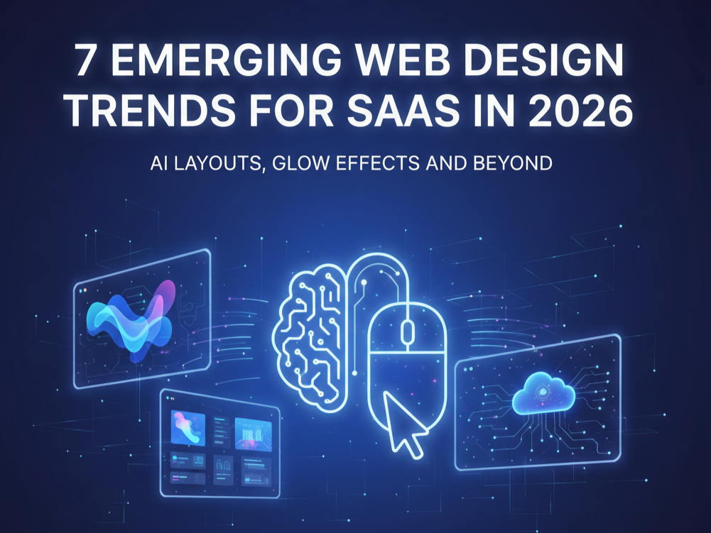
7 Emerging Web Design Trends for SaaS in 2026: AI Layouts, Glow Effects, and Beyond
Web design is changing at the same quick rate as the SaaS landscape in order to satisfy users' ever-increasingly complex demands. Successful SaaS organizations are moving away from prefabricated templates as we approach 2026 in favor of interfaces that actively promote user involvement and retention in addition to being aesthetically pleasing.
Conversion rates, user engagement, and competitive positioning are all immediately impacted by the new trends, which are intentional decisions. They transcend mere aesthetic tastes. Let's look at the top seven trends that will influence SaaS web design in 2026, along with implementation strategies and real-world examples.
1. AI-Powered Layouts and Hyper-Personalization
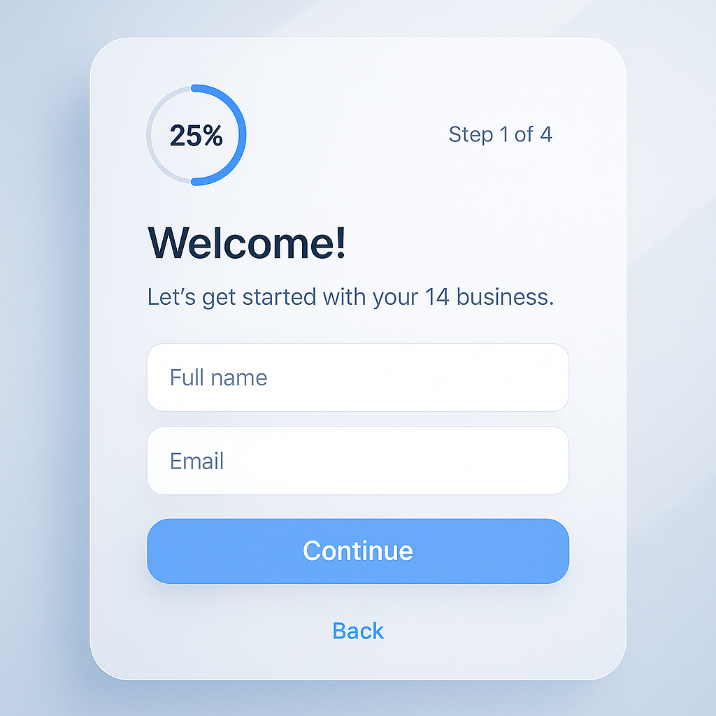
One-size-fits-all, static SaaS websites are coming to an end. By 2026, AI-powered personalization will revolutionize the way websites instantly adjust to each user. In order to dynamically modify layouts, content hierarchy, and even color schemes, these intelligent systems examine user behavior, industry vertical, company size, and interaction patterns.

These days, top SaaS platforms use AI algorithms that pick up knowledge from each visitor's journey. A project management platform might, for instance, highlight automation tools for individual contributors and collaborative features for team leads. Beyond just content, the entire interface architecture is customized to meet the unique requirements and tastes of every user.
Webflow Implementation: Make use of CMS-driven content blocks in conjunction with conditional visibility settings. Create customized experiences by integrating external AI services via Webflow's API connections. Implement basic customization rules using Webflow's logic flows, then expand with more complex integrations as your data sophistication increases.
Real-World Impact: Businesses using AI-powered personalization report gains in trial-to-paid conversion rates of up to 25% and increases in user engagement of up to 40%.
2. Glow Effects and Futuristic Color Palettes
In SaaS design, neon glows, electric gradients, and luminous accents are having a strong resurgence. By highlighting important actions, establishing a visual hierarchy, and developing a cutting-edge brand perception that appeals to tech-forward people, these effects accomplish more than just being just decorative.
Glow effects are used sparingly yet deliberately in the best applications. Subtle illuminating borders around call-to-action buttons can boost click-through rates by as much as 15%. Hover effects with soft luminescence give users instant feedback, while progressive loading states with illuminating animations shorten perceived wait times.
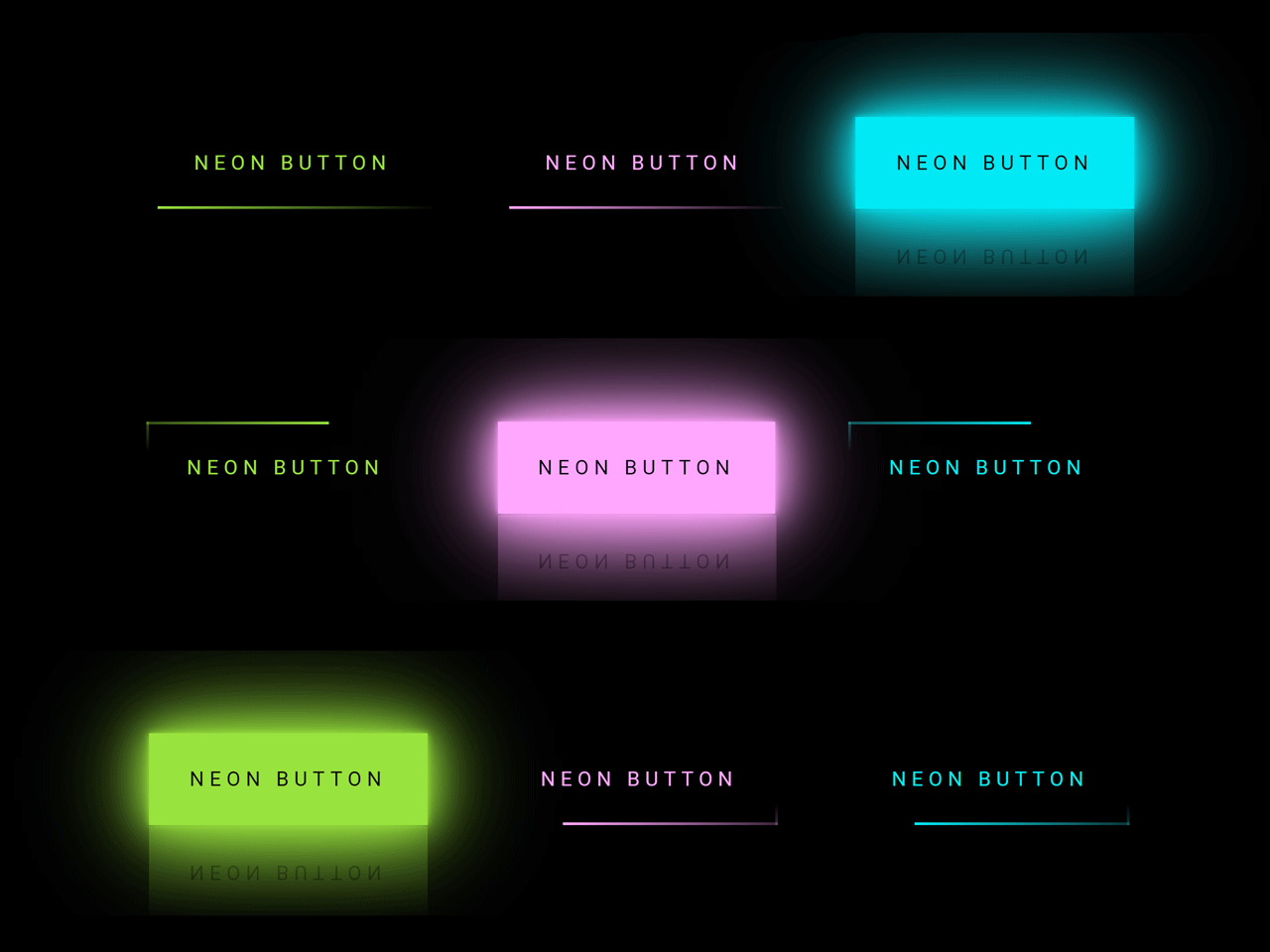
Color Psychology in 2026: Warm neon oranges and pinks imply creativity and approachability, while electric blues and cyans express brilliance and ingenuity. The secret is to balance these striking details with neutral colors and lots of white space.
Webflow Implementation: Using CSS filters and layered div blocks, create unique glow effects. Use Webflow's animation panel to provide breathing or pulsating effects to important interactive elements, and implement hover states with seamless transitions.
3. Minimalism with Heroic Typography
Large, expressive type combined with clear, roomy layouts enhances readability and comprehension while producing an immediate visual impression. Users' desire for simplicity over complexity is reflected in this trend, particularly in SaaS interfaces where user success is directly impacted by speedy comprehension.
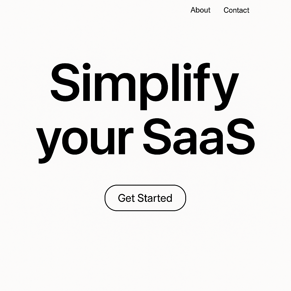
Typography serves both a design element and a means of delivering content in the most successful implementations. Carefully chosen typefaces for headlines that are 72 pixels or larger serve as visual anchors that direct readers through the page experience. White space, which typically makes up 60% or more of the page, is strategically used to provide breathing room, which improves focus and lessens cognitive load.
Best Practices for 2026:
- Use a maximum of one bold show typeface and one clean body font.
- Strategically employ font weights to establish hierarchy without introducing visual noise.
- Use responsive typography to ensure that it remains effective on all screen sizes.
- For smooth scaling and delicate animation effects, take into account variable fonts.
Webflow Implementation: Benefit from Webflow's responsive typography controls and changeable font support. Make your own font combinations and utilize the typography panel to create uniform site-wide hierarchy.
4. Brutalist and Authentic Aesthetics
As companies look for genuine difference, brutalist aspects are becoming more popular in SaaS, moving away from overly polished, template-driven designs. In order to break through digital noise and produce unforgettable experiences, this movement embraces raw edges, sharp contrasts, and purposeful defects.
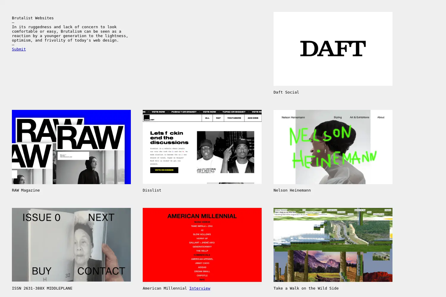
Effective brutalist SaaS designs strike a mix between usability and rawness. Bold sans-serif fonts, asymmetrical layouts, high contrast color schemes (typically monochromatic), and sparse ornamentation are some of its defining features. Instead than shocking, the aim is to convey confidence and sincerity in a busy market.
Strategic Applications:
- For instant visual impact, include brutalist elements into hero areas.
- Use strong contrast for crucial messaging and calls to action.
- Use deliberate asymmetry to disrupt recurring grid patterns.
- Maintain outstanding usability in spite of unusual visual selections.
Webflow Implementation: Use Webflow's absolute positioning to overcome conventional grid restrictions. In order to retain responsive operation and add visual appeal, combine bold font with subdued color schemes and purposeful spacing anomalies.
5. Dynamic Motion and Functional Micro-Interactions
2026 micro-interactions prioritize functionality over ornamentation; each animation fulfills a particular user requirement or corporate goal. These understated animations lower friction in intricate SaaS workflows, direct user attention, and offer real-time feedback.
Hover states that preview functionality, completion animations that offer positive reinforcement, and progress indicators that display system status are some of the most powerful micro-interactions in SaaS design. By implementing smart micro-interactions, companies such as Calendly report 25% improvements in booking completion rates and 15% increases in user happiness.
High-Impact Examples:
- Progress Visualization: Onboarding sequences that commemorate milestone completion feature animated progress bars.
- Smart Feedback: Instantaneous contextual coaching through form validation.
- Status Communication: Loading states that provide precise information about current events and anticipated completion dates.
- Guided Discovery: Quiet animations that highlight significant activities or new features.
Webflow Implementation: Create click-based state changes, hover animations, and scroll-triggered reveals with Webflow's interactions panel. Instead than concentrating only on aesthetically pleasing transitions, make sure they seem natural and have obvious practical reasons.
6. Accessibility-First and Mobile-Optimized Performance
Accessibility and mobile-first concepts are now fundamental necessities, not afterthoughts, at the outset of design. Since more than 62% of visitors to SaaS websites occur on mobile devices, responsive design must give top priority to touch interactions, understandable typography, and quick load times on all platforms.
High contrast ratios (at least 4.5:1), keyboard navigation capabilities, screen reader compatibility, and distinct focus indicators are important accessibility factors for 2026. All users gain from these enhancements, which also guarantee adherence to changing accessibility guidelines.

Mobile-First Optimization:
- Button sizes that are touch-friendly (minimum 44px)
- Streamlined navigation for contact with the thumb
- Streamlined content structure for scrolling vertically
- Optimizing performance for sluggish connections
Webflow Implementation: Work your way up to the desktop from Webflow's mobile breakpoint. Make use of semantic HTML elements, apply appropriate heading structure, and do extensive accessibility tool testing. For better performance, reduce custom code and optimize pictures.
7. Organic Shapes and AI-Generated Illustrations
In order to humanize technical SaaS goods, AI-generated creative graphics and distinctive, organic shapes are replacing static stock photography. Through visual metaphor, these organic, flowing shapes evoke strong feelings and aid in the explanation of difficult ideas.

Users' demand for warmth and approachability in more automated surroundings is reflected in the tendency toward organic shapes. While retaining professional credibility, blob shapes, flowing lines, and changing backgrounds give personality.
When compared to generic stock imagery, businesses who use personalized AI-generated graphics report higher levels of emotional engagement and brand awareness.
Strategic Applications:
- Background components that add depth without drawing attention to themselves
- Dividers between sections that direct the viewer's gaze through the content
- Systems of illustrations that facilitate in-depth product descriptions
- Interactive components that react to human actions
Webflow Implementation: Utilize Webflow's transform attributes to import unique SVG shapes and produce morphing animations. Incorporate AI-generated artwork that enhances the brand narrative and value proposition of your product.
Implementing These Trends in Webflow: A Strategic Approach
In order for these trends to succeed, they need to be applied intelligently, prioritizing user experience and business objectives over purely aesthetic considerations. Choose the trends that best fit your brand positioning and user needs first, then implement them gradually while monitoring the impact on key performance indicators.
Priority Framework:
- High Impact, Low Risk: Begin by adding micro-interactions and typographic improvements to existing designs.
- Medium Impact, Medium Risk: Use organic shapes and glow effects in particular campaigns or parts.
- High Impact, High Risk: Consider AI personalization with brutalist elements for major redesigns or the launch of new products.
Measurement and Optimization:
Monitor conversion rates, user engagement data, and qualitative feedback throughout deployment. The most successful SaaS companies consider these trends to be tested hypotheses rather than foolproof solutions.
Conclusion
Brands that are prepared to embrace innovation while keeping user success front and center will dominate the future of SaaS web design. These seven trends are more than just changes in style; they are tactical instruments for creating stronger bonds, improving conversions, and creating long-term competitive advantages in a market that is becoming more and more congested.


Turn Your Vision into a Scalable Digital Experience
From brand to backend, we create systems and experiences that actually move the needle.

Double Your Site Engagement: Easy Webflow Chatbot Setup Tutorial

How Webflow AI Actually Makes Design Prototypes in 2025 (Designer's Guide)

